
If you’re new to investing then understanding how to read stock charts can be more than a little intimidating. Most stock charts are pretty basic. You will typically see the price of the stock on the vertical axis and a period of time on the horizontal axis.
Usually, when you are creating your chart it will ask you what period of time you would like to look at. You can look at the chart for a period of time as small as 5 minutes or as long as 30 years.
What you are seeing is the price of that stock at any given time along the horizontal axis.
Let’s start with the basics and identify two different types of charts that you may see as you research your favorite companies.
You can always make a chart yourself, with dozens of tools available online. One simple chart builder is Yahoo Finance.
Line Chart
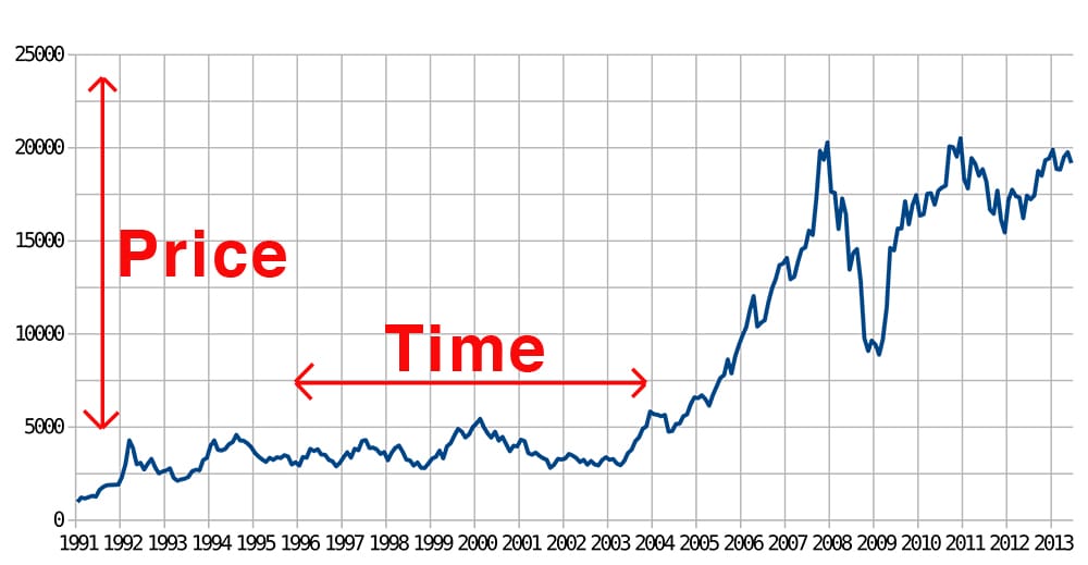
A line chart is the most common type of chart you will run into, and likely the type of chart you have already seen. As you can see with the line chart above,
the price of this stock started close to $100 (vertical axis), but over the period of about 22 years, the value has risen to nearly $2000 This means if you had invested $100 in 1991, you would have made $1900 additional dollars by 2013. What a great investment!
Candlestick Chart
A candlestick chart will look similar to a line chart but actually includes much more information. Knowing how to read a stock chart like this can be incredibly useful to an investor.
As you can see on the chart above each day on a candlestick chart looks like a small candlestick (with the wick sticking out of the top and bottom of course). Each candlestick is packed with information.
Color – the color of the candlestick will tell you whether the price of stock ended the day higher or lower than when it began. Green typically means higher and red means lower, though different brokers will sometimes lay it out with different colors.
Wick – the wick on the top and on the bottom show the high price and low price of the day.
Candlestick – the candlestick itself has a top and a bottom. Each one shows either the opening or closing price of the day. If the candlestick is green (meaning it closed higher than it opened), then you know the opening price was the bottom of the candlestick.
Patterns
As explained in our technical vs fundamental analysis course, technical analysis is when traders figure out how to read stock charts to help them know when to buy and when to sell their shares of that stock.
There are dozens, of different patterns that have been identified and hundreds of courses that can teach traders some of the most effective patterns to use. Here are a few common patterns to give an idea of what we are talking about.
Support and Resistance
The concept of support and resistance is simple. Think of support as a floor. Whenever the price of the stock is dropping, and it hits that floor, it has a tendency to start climbing. Every time the price starts falling and hits that price point it has a tendency to bounce and start climbing. This is a pattern.
If you are looking for a simple method on how to read stock charts as a beginner, this one is the easiest to identify. A stock market trader will simply buy the stock when the price reaches that support line, then sell it at a higher price point later on.
Resistance is the same concept as support, but with a roof. Each time the price of the stock starts climbing, it has a tendency to stop climbing and start falling when it hits that resistance line. Market traders will sell the stock or short the stock at this point.
Usually, if a stock breaks through a support or resistance trend than it will continue in that direction for a while. So on our Amazon example, if the price dropped below the support price, it might be a good idea to sell because it has broken through support and could drop significantly further.
The same is true for resistance lines. If a stock price breaks through the resistance line then there is a good that price will continue to climb for a while. This is called a breakout.
Trend Line
Trend line analysis is another commonly used tool for those who know how to read stock charts. Finding a trend line is similar to support and resistance, except it doesn’t have to be a specific price that offers support or resistance.
Instead, you are trying to find a trend line where reversals occur. This means you are looking for a line to draw where the price of the stock always seems to change directions.
Head and Shoulders
The last pattern we are going to talk about is a commonly used pattern called head and shoulders. This is exactly as it sounds. You are trying to find a pattern in the charts that looks like a head with shoulders. Here’s a quick example.
To those that know how to read charts, a head and shoulders are a good sign that the price of a particular stock is likely about to stop climbing and about to start dropping.
What you are looking for with the head and shoulders pattern is for the shoulder on the right side to be lower than the shoulder on the left. This means that the price of the stock failed to break new highs, and then failed to break previous highs, and is now likely going to begin a long term fall.
If you own shares of a stock and begin to see ahead and shoulders pattern it would be wise to well. If you want to short a stock, choosing a stock that recently demonstrated a head and shoulders pattern would be a great choice.